Now that I’ll be launching my new design kits, I thought it make sense to create a series of articles about “how to create color palettes” and the different steps to develop a design project.
After chatting with a few clients, I realized that one of their biggest struggles is simply narrowing down their color palette when diving into a new project. — To help you navigate the world of color pairing, I’ve put together this helpful post! ✨

The usage of color is one of the easiest ways to change any space’s look and mood. I’m not just talking about paint colors—though that’s a significant way to help set a color palette in a room. But textiles, art, and decor are all things you can implement to help establish your color palette.
But how do you choose those colors, and how do you know which ones go well together?
HOW TO CHOOSE COLORS FOR YOUR ROOM
The truth is that we’re all drawn to specific hues, and different colors may create distinct feelings within you. So, when thinking through how to stylize a room and what colors to include, there are a few questions you can ask yourself:
- Off the top of your head, what is your ideal color palette (4-6 colors)?
This is just for you to reference as we move forward; I want to see if what you have in your head currently will start to align as we go through the post.
- What 3 adjectives describe the emotions you want to evoke?
Ex: sophisticated, ethereal, modern, minimal, warm, relaxed, whimsical, calm, earthy, elegant, etc. (feel free to google more too). This is your ‘design essence’ and what kind of emotion you want your home to provide people.
- What colors am I drawn to most?
Think neutral or bold colors, something subtle or more vibrant.

- If you could go shopping anywhere (unlimited budget), where would it be?
This would be for clothes, home decor, accessories, etc. Think about where you like to shop. Ex: Crate & Barrel, Target, Magnolia, Studio McGee, etc.
- From your selection above, what descriptive words come to mind when you look at those brands?
Example: Magnolia feels organic, textured, natural. Crate & Barrel feel simplistic, minimal, neutral. Studio McGee is bold, creative, playful, airy. Etc.
3 WAYS TO THINK ABOUT COLOR
Now that you’ve answered a few questions let’s dive into color theory. As we know, color can play a considerable part in emotions. During the selection of colors for your space, there are three core ways you can think about color.
It involves the amount and intensity of color in your room and goes on a spectrum from neutral to bold use of color.
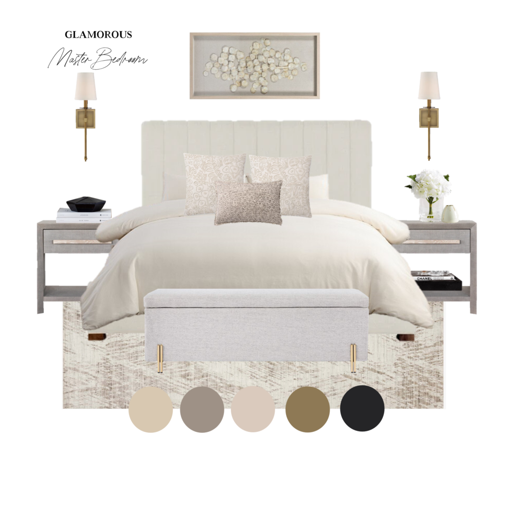
NEUTRAL COLORS
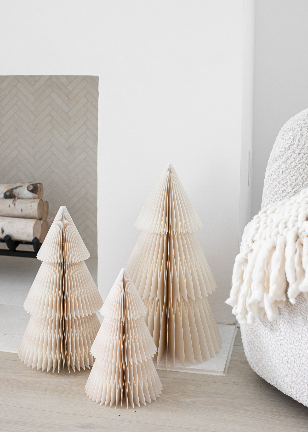
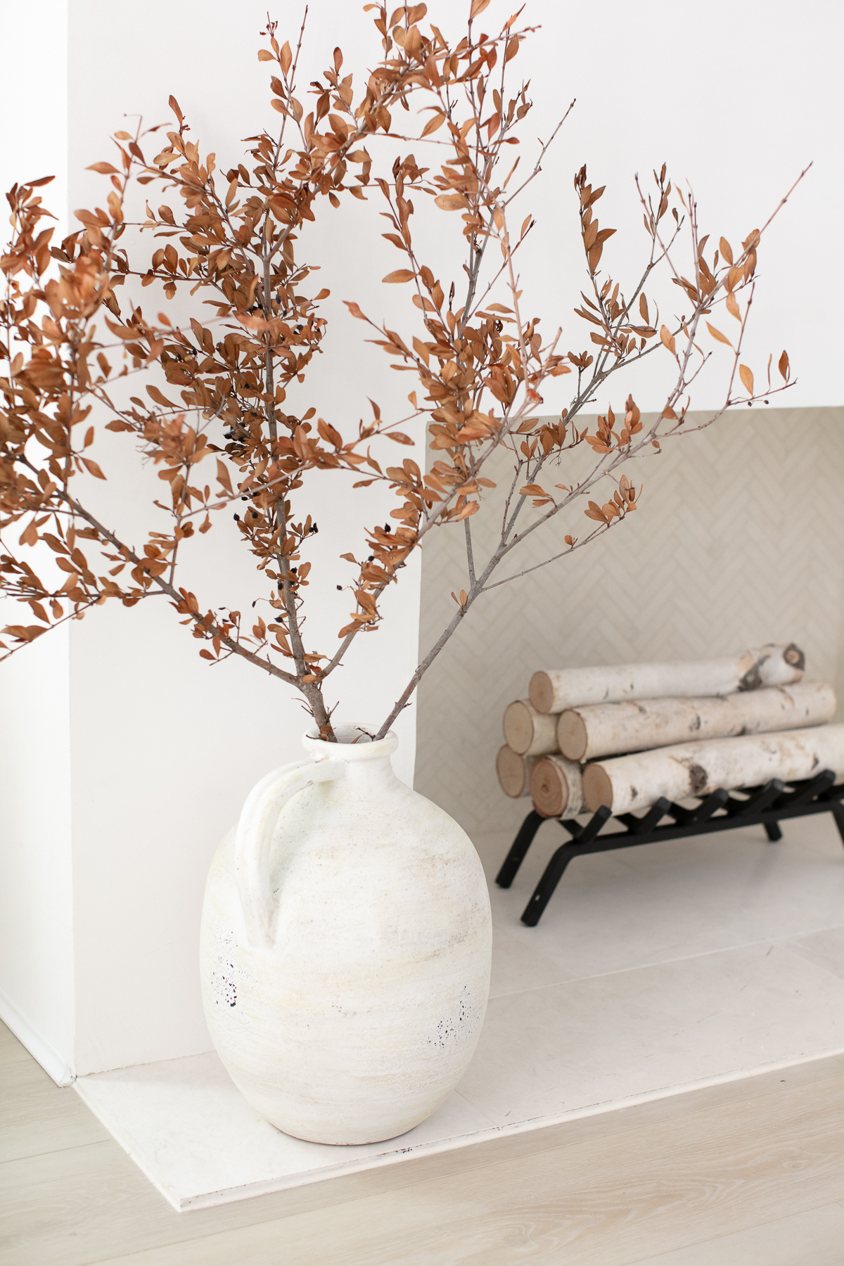
They are hues with more subdued colors, such as white, taupe, beige, black, and grey. You can layer them in with more bold and saturated colors.
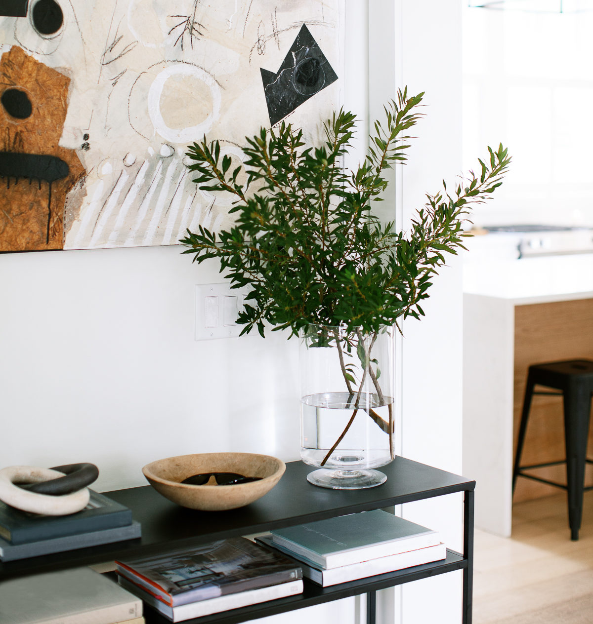
But they can also live on their own very well. If you love neutrals but want your room with a little more “oomph,” don’t be afraid to layer in some contrasting or darker neutrals.
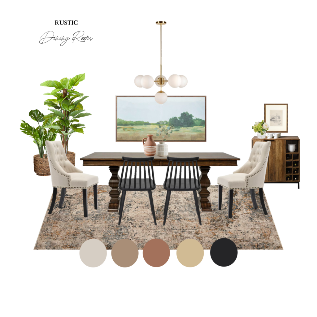
POPS OF COLOR
This is perfect for people who like to dabble in trends or are whimsical about color schemes since you can easily change your colors with the season.
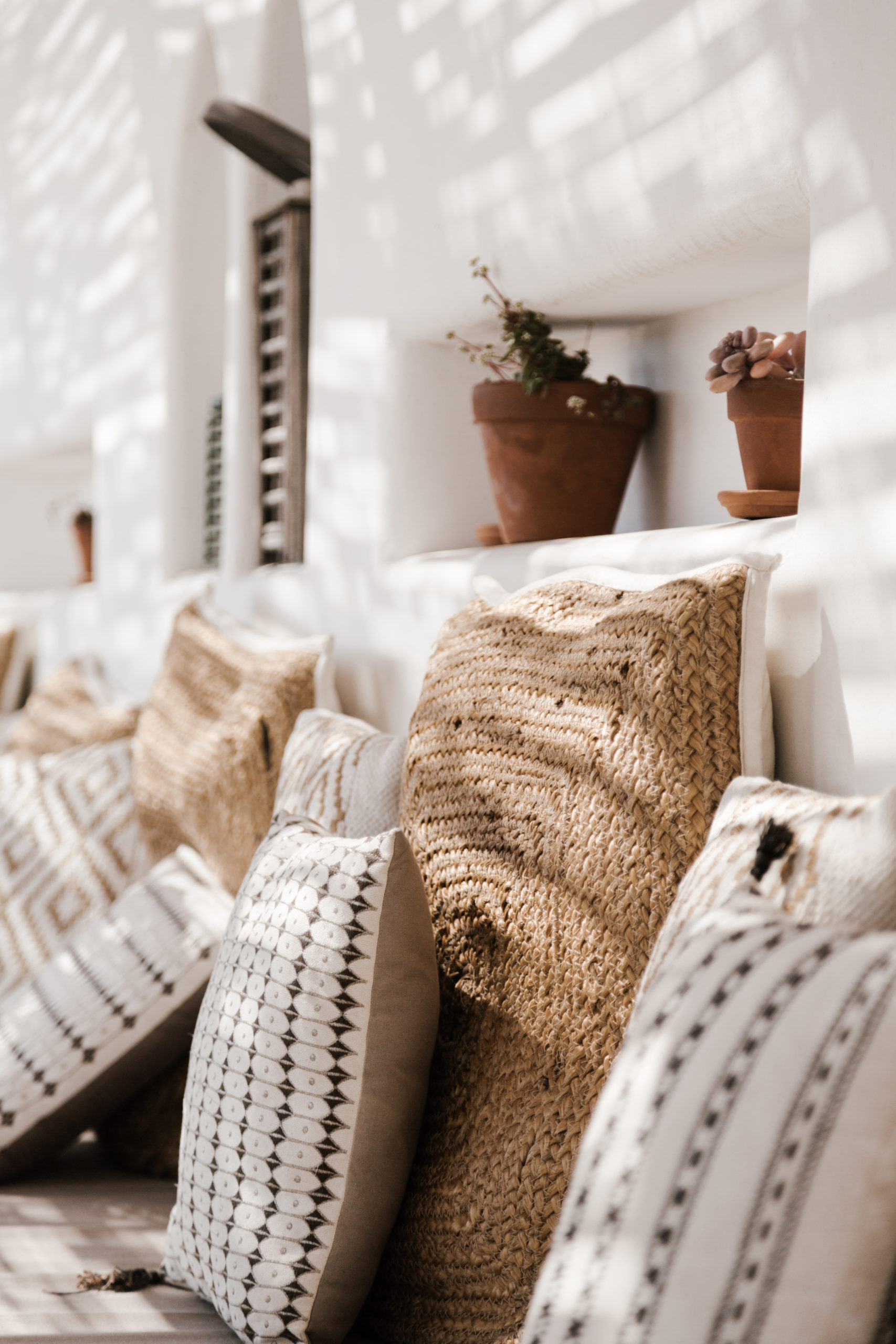
Or if you’re someone who’s drawn to a bit of color but don’t want to go all out, you’re the perfect candidate for using pops of color! You might have a neutral base in your main furniture and walls, but you can incorporate colors in smaller pieces that are easy to switch out.
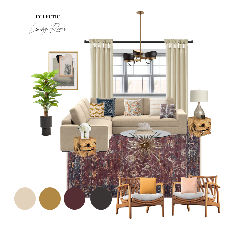
BOLD COLORS
The final way to use color is by taking a really bold approach. Bold colored rooms use highly saturated hues, and there is often a mix of multiple bright shades. The result? A space with a lot of drama.
Ok, don’t freak out! Rooms with bold use of color can be turned up or down. You can incorporate a neutral colored sofa with bold colors around it, on your walls, and through your rugs, pillows, artwork, and decor. Be bold… Have fun!
CREATING YOUR COLOR PALETTE
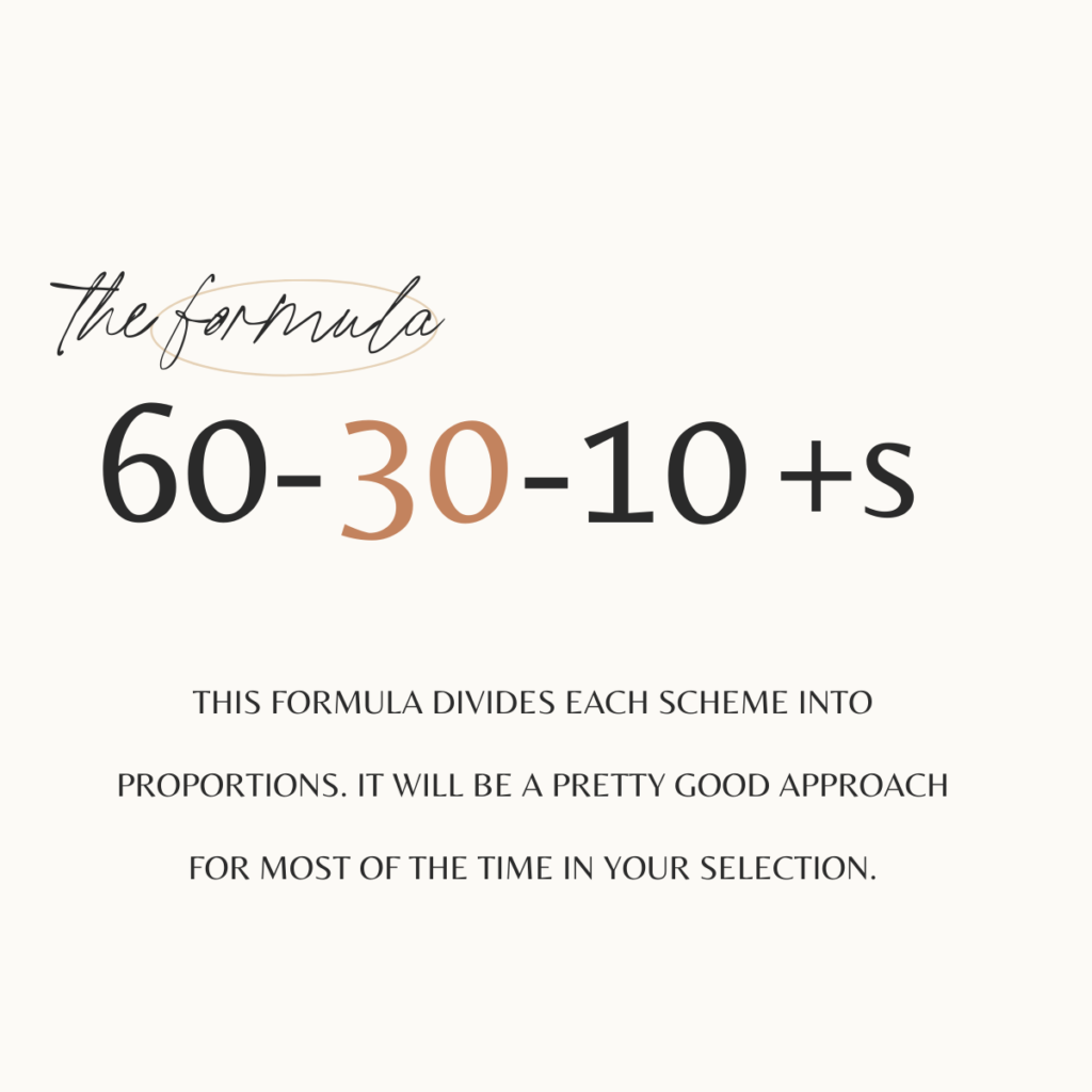
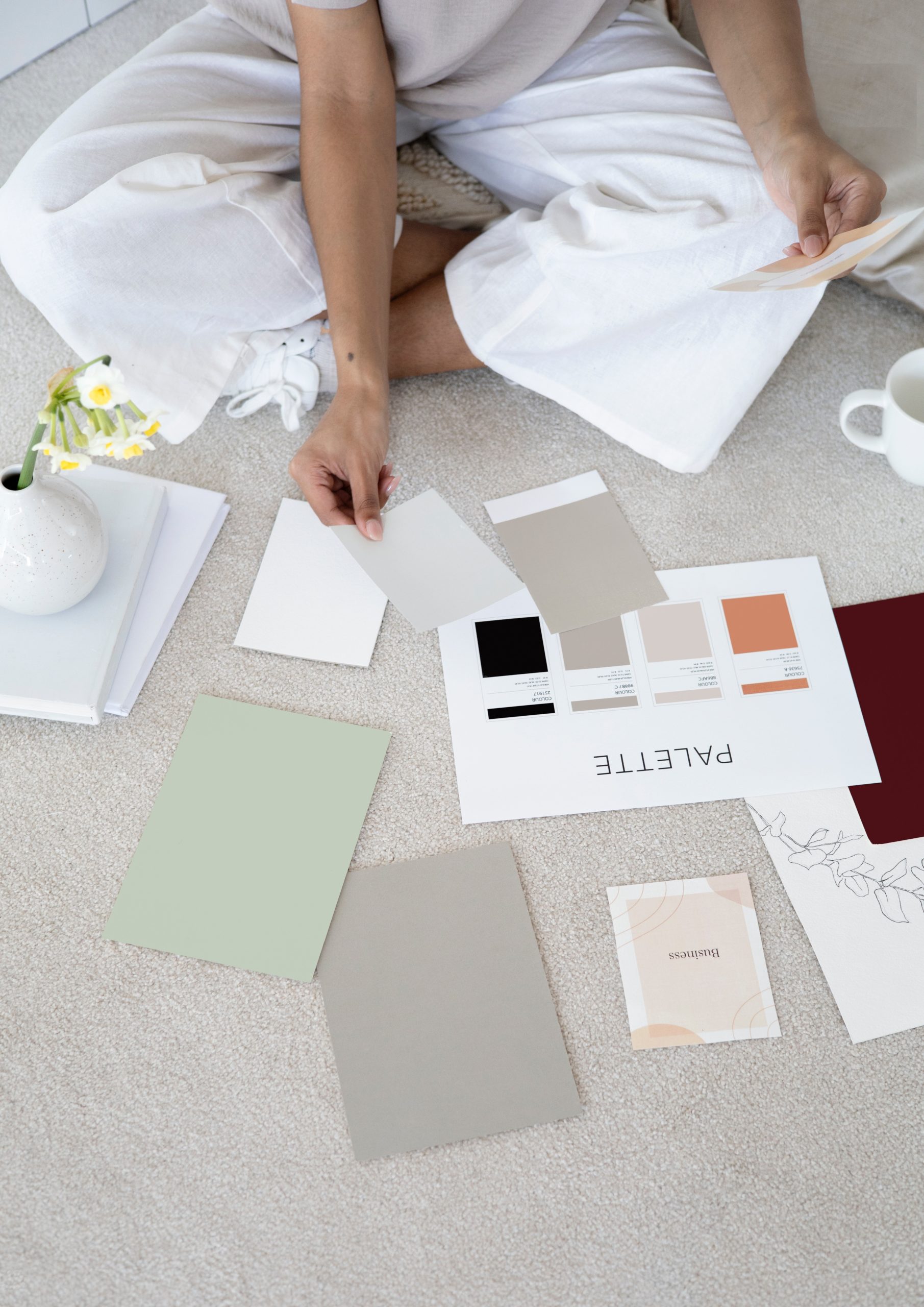
Now that we understand how color helps set the tone for space and influences our design style, we must come with the right formula for curated colors!
THE PROPORTIONS AND DISTRIBUTION OF THE COLOR PALETTE
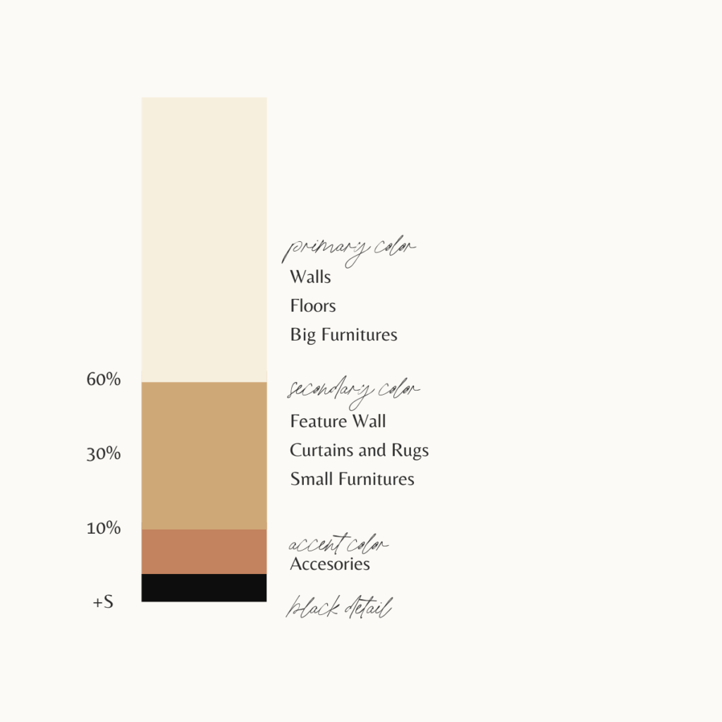
▪️ 𝟔𝟎 𝐩𝐞𝐫𝐜𝐞𝐧𝐭 𝐨𝐟 𝐭𝐡𝐞 𝐫𝐨𝐨𝐦 will be in one or two main colors.
👉 I personally pick a neutral base.
▪️ 𝟑𝟎 𝐩𝐞𝐫𝐜𝐞𝐧𝐭 𝐨𝐟 𝐭𝐡𝐞 𝐫𝐨𝐨𝐦 will be in subtle and harmonious (Not contrasting) colors.
👉 The purpose is to lift the main color(s).
▪️ 𝟏𝟎 𝐩𝐞𝐫𝐜𝐞𝐧𝐭 𝐨𝐟 𝐭𝐡𝐞 𝐫𝐨𝐨𝐦 will be spiced with one or two contrasting colors.
👉+𝐒 in the formula stands for one 𝐬𝐦𝐚𝐥𝐥 𝐛𝐥𝐚𝐜𝐤 𝐝𝐞𝐭𝐚𝐢𝐥, which is necessary to give vigor to the chosen colors.
