Over the past few years, several different colors have happened in the design world. Millennial Pink was the color of the moment in the early 2017’s (and got the ball rolling), followed by Gen Z Yellow, Slime Green, Aperol Orange.
But that was so at the time, and as we had expected, Pantone, a.k.a. The judge and the jury on everything related to color have the tone we were expecting.
They introduced the color of the year 2020: Classic Blue, a timeless and lasting blue shade.
I know what you may think: classic blue, OMG what a dull color! And it may be.
But if you take a look at today’s most talked-about trends, you will undoubtedly see this particular shade appear more frequently.
Pantone describes it as a non-aggressive, easily identifiable, robust, and reliable tone that offers the promise of protection, one of the qualities that people long for as they cross the threshold into a new era.
CLASSIC BLUE IN DESIGN
Naturally, I’m more than thrilled with the freshness of the solid shade of blue. I think color means a return to aspects of traditional design.
People look for spaces that are welcoming, warm, and comfortable. These characteristics evoke feelings of nostalgia.
Classic blue is — well — traditional, and it’s a color that’s always been in fashion and will continue to be.
It is an excellent choice for anyone who wants their environment to feel like a stable moment in a changing world.
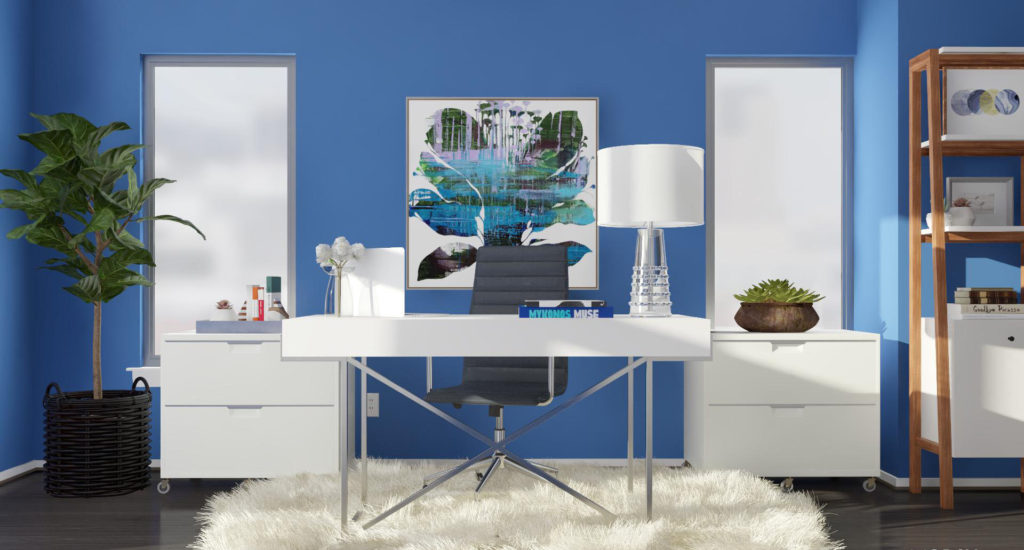
LOOK # 1: CLASSIC AND GLAMOROUS WARMTH
For me, the tone is infinitely inspiring and versatile. Classic blue can be described as a genuinely timeless color that can transcend styles and trends.
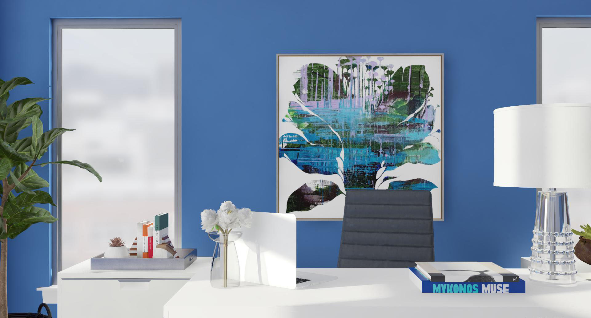
How I used color: For the design of this office, I used the boldness and versatility of Classic Blue as an elegant approach.
Along with bright whites and contrasting tones, it demonstrates how the color has enough shine and pop to steal any show.
However, I think the real power of the blue hue is when it is used as a primary color in a space. It allows deep nuances to create a feeling of enveloped security and calm.
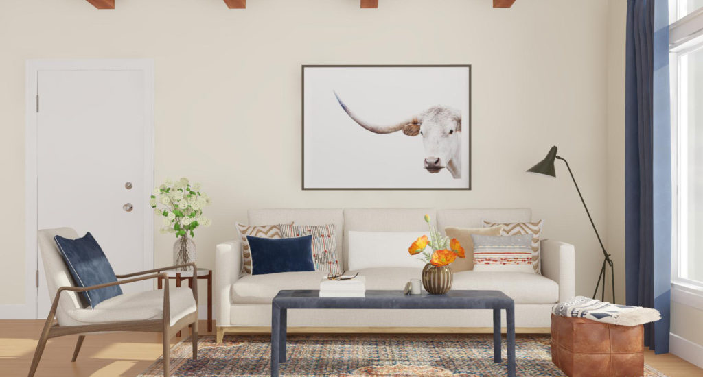
LOOK # 2: CLASSIC AND SIMPLY MODERN
Just as blue jeans are an undisputed staple in the fashion world for as long as anyone can remember. Not to mention, they can be matched with almost anything. Just that is this color.
I am excited to see “Classic Blue” used as a neutral element in home decor.
How to use color: I imagine a space that has warm tones connected by blue; Proper use of color makes the area feel perfectly sharp, clean, and simple with just the right amount of impact.
“The idea is for Classic Blue to be a way for modern minimalists to explore and experiment with color.”
The blue in this living room has a classic appeal, but it’s not overpowering or overly engaged for lovers of modern design.
It’s also bold but calming, and it’s a natural shade.
All of this makes it an easy-to-relate accent color that will encourage even the most assertive minimalists to dip their fingers into a world of color.
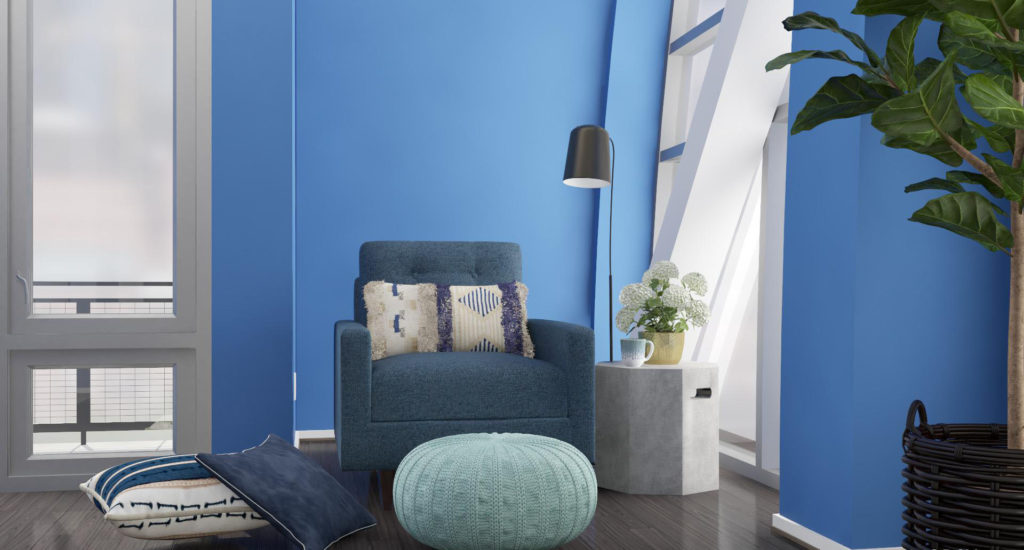
LOOK # 3: CLASSIC AND CAPTIVATINGLY GREAT
Classic Blue is more playful and vibrant than any other trendy navy shade. But it is also a shade that I think anyone can easily incorporate into their space.
Its solid tone creates contrast and balance even with the mixture of the same blues.
How I used the color: I wanted to create a corner where the blue tone will be launched directly on the walls. This traditional color is seen from a contemporary angle that involves patterns and shapes.
The texture is key to successfully incorporating this shade.
Just as you can see in the photo, this takes strength in the patterns and textures that, together with finishes such as wood, concrete, and metal, create a cozy atmosphere and transport it to another level.
